

Avoiding Mistakes in Campaign Card Design
Never use long paragraphs in your campaign card design. Text needs to be broken out into easy to read bullet points.You need to get your message across really fast as your intended target has most likely just gotten his/her mail out of the letterbox and your card is competing in interest with other items. If the text is not jumping out and is not eye catching, you're going to loose an opportunity to get your message across and the card might find it's way very quickly to the trash can without ever having been read: a loss for you and your campaign effort.
Get rid of any large text blocks. Edit them to basic bullet points where there is no more than two sentences. Use thick/bold fonts and non traditional design for bullet points, like stars. For any sort of numeric data, try to display the information in an attractive chart format rather than plain text.
Repeated surveys have shown that people scan advertisements rather than reading text blocks, so this is why your campaign card must be formatted in bullet points.
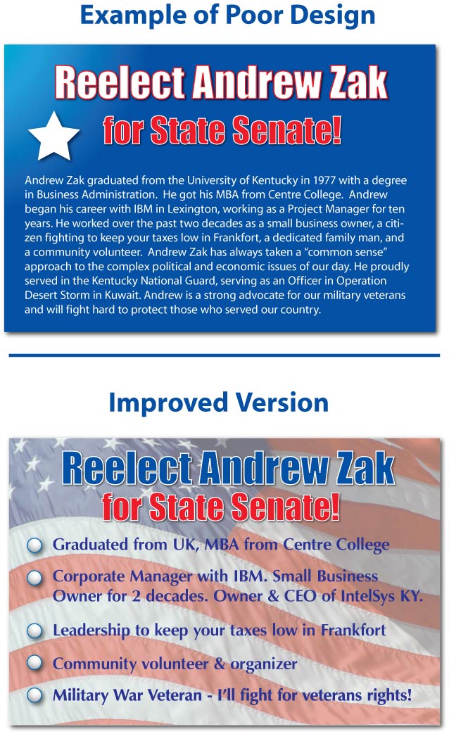
In the example below, the first design has one long text paragraph. People tend to avoid reading such advertisements and this card might be thrown away without ever having been read. In the next example is better. It takes the main points of the paragraph and organizes them into a few bullet points. See how much easier this version is to read?
<!-- END formexperts.com Form Code --></p></blockquote></td>
</tr>
</tbody>
</table>
</div>
</body></html>